

Kraft Heinz Chile
Designing within a global system.
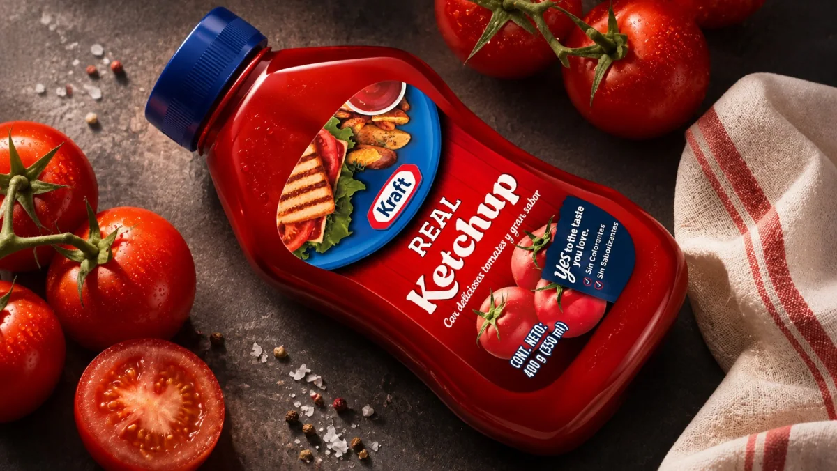
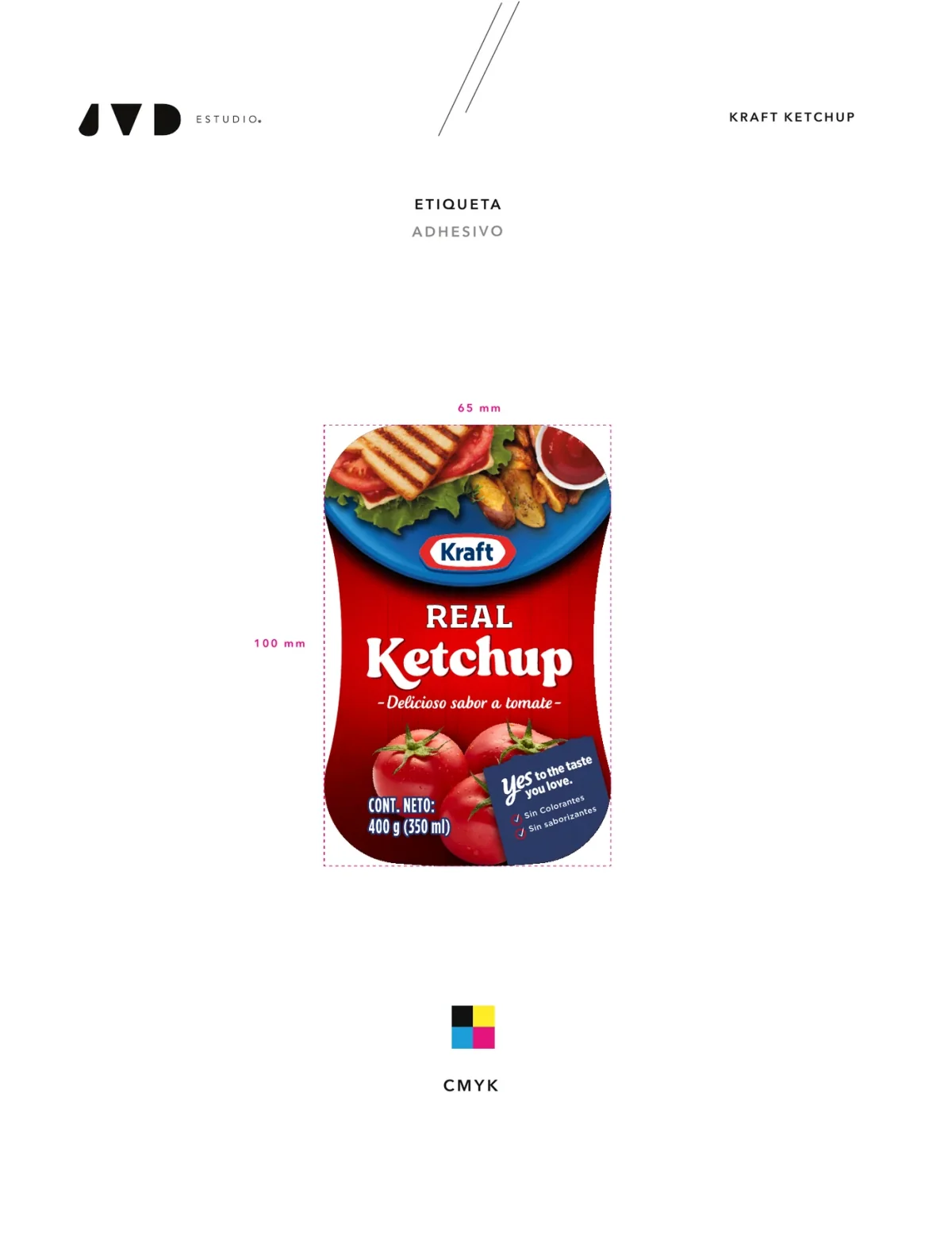
Kraft Real Ketchup 400 g squeeze · editorial visualisation based on the current commercial label
- Client
- Kraft Heinz Chile
- Project
- Packaging, portfolio adaptation and new design for Kraft Real Ketchup
- Years
- 2020–2023
- JVD scope
- New Kraft Real Ketchup design (2023), format adaptations, portfolio extensions, displays, sachets, mockups, final artwork for production and photographic art direction.
Context
Kraft and Heinz arrive in Chile with global systems: logos, colours, brand architecture and tightly defined production standards. Kraft Heinz Chile needed to handle a continuous flow of local needs (new formats, extensions, point-of-sale pieces and production artwork) without any solution fragmenting brands recognised all over the world.
It was not an identity brief from scratch. It was a matter of judgement inside a system that already existed.
The decision
Intervene only where it was needed. Understand each brand's codes well enough to extend the portfolio, adapt formats and, where it made sense, put forward proposals, without replacing what already made Kraft and Heinz recognisable.
Designing within a global brand does not always mean changing more. Sometimes it means knowing exactly what to move.
Kraft Real Ketchup
In 2023 the brief moved from adapting to designing: a new packaging for Kraft Ketchup. The proposal reorganises codes the brand already owned. The blue plate builds appetite, red holds the category, the tomatoes make the ingredient visible and the name REAL Ketchup takes centre stage. The hierarchy becomes more direct.
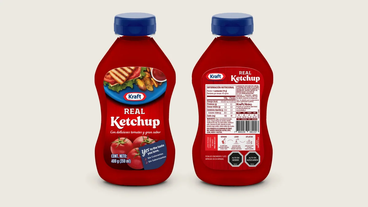
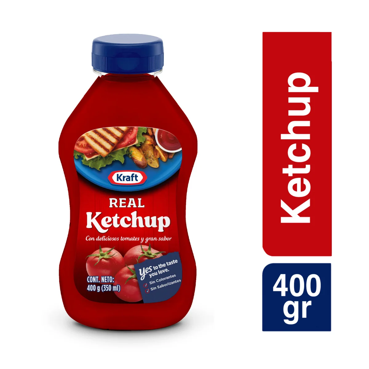
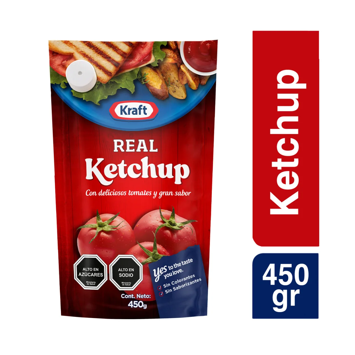
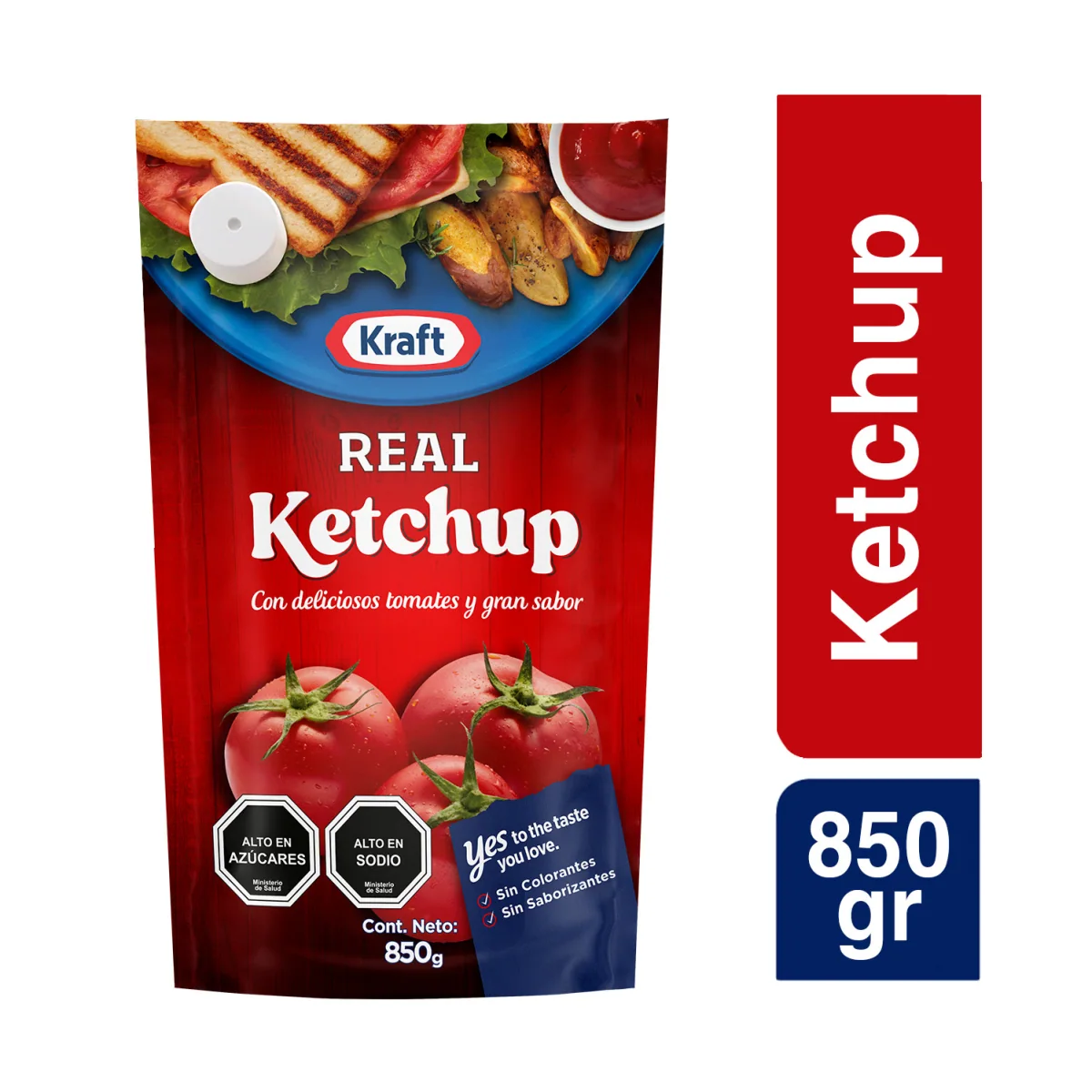
400 g squeeze · 450 g doypack · 850 g doypack · e-commerce images, JVD development mockups
The system had to work on squeeze bottles, doypacks and displays, with very different geometries and proportions. It does not repeat a label mechanically: it keeps one reading logic and adapts it to each pack.
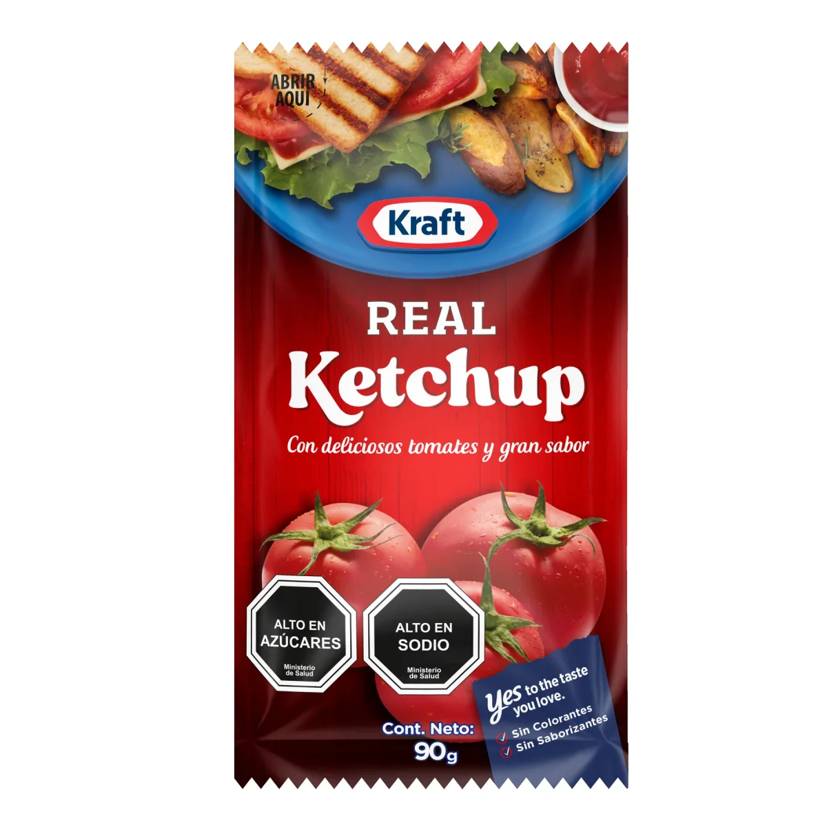
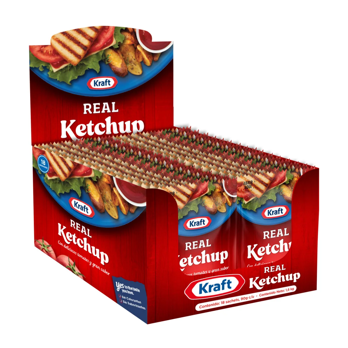
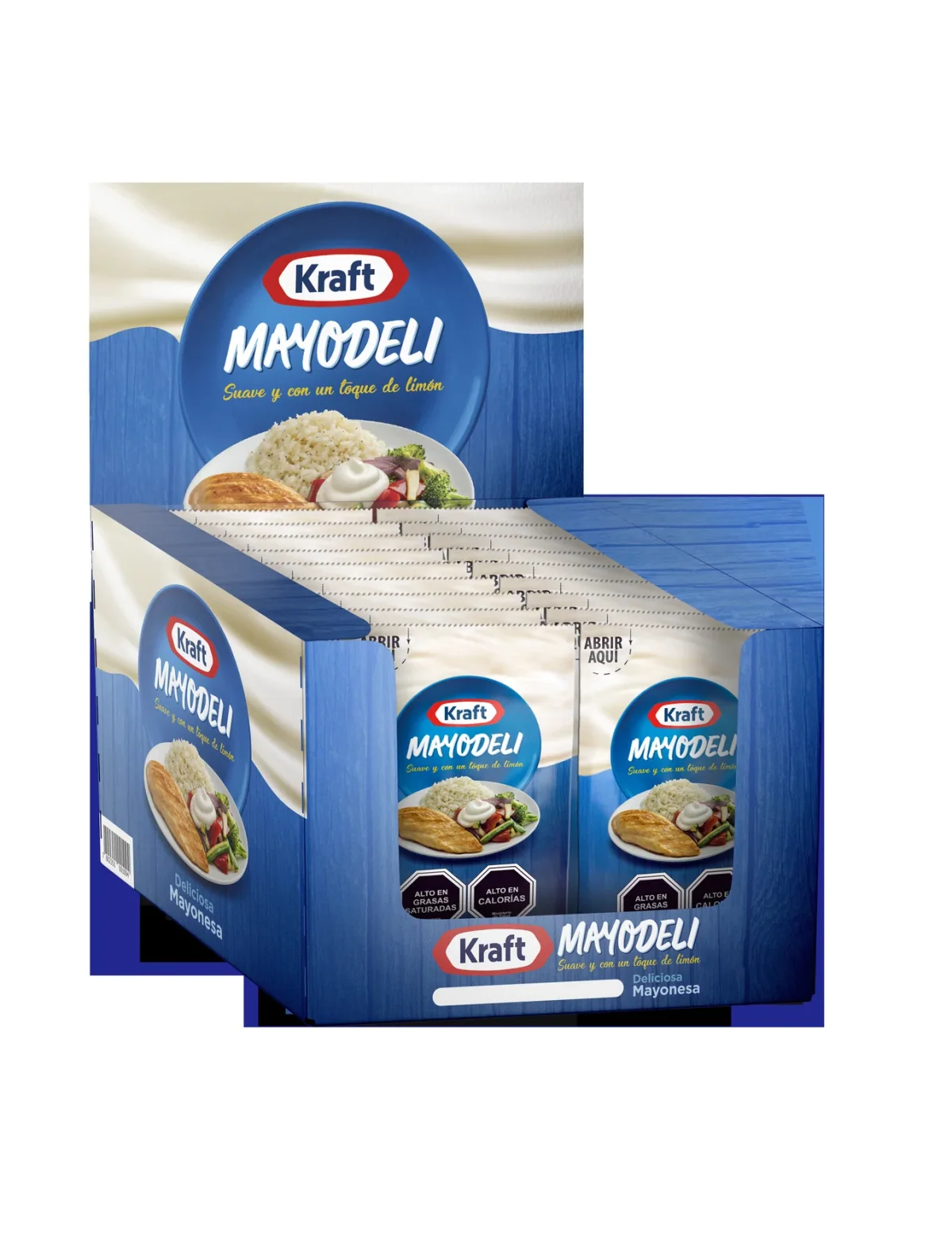
90 g sachet and 18-sachet point-of-sale display · JVD development mockups
From concept to final artwork
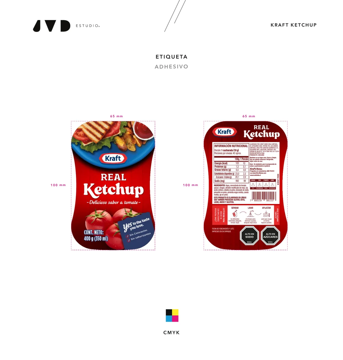
The design was taken to final artwork for production. The technical artwork includes front, back, nutrition information, seals, legal text and codes: every design decision had to survive the real demands of the pack.
Running the portfolio
Before the Ketchup, the relationship was built through continuous work on the portfolio: Heinz Mayo regular and Light, Kraft Mayo Deli, sachets, displays, e-commerce mockups, technical adaptations and production artwork. Each piece was different, but the rule was the same: a local solution still had to feel part of a global brand.
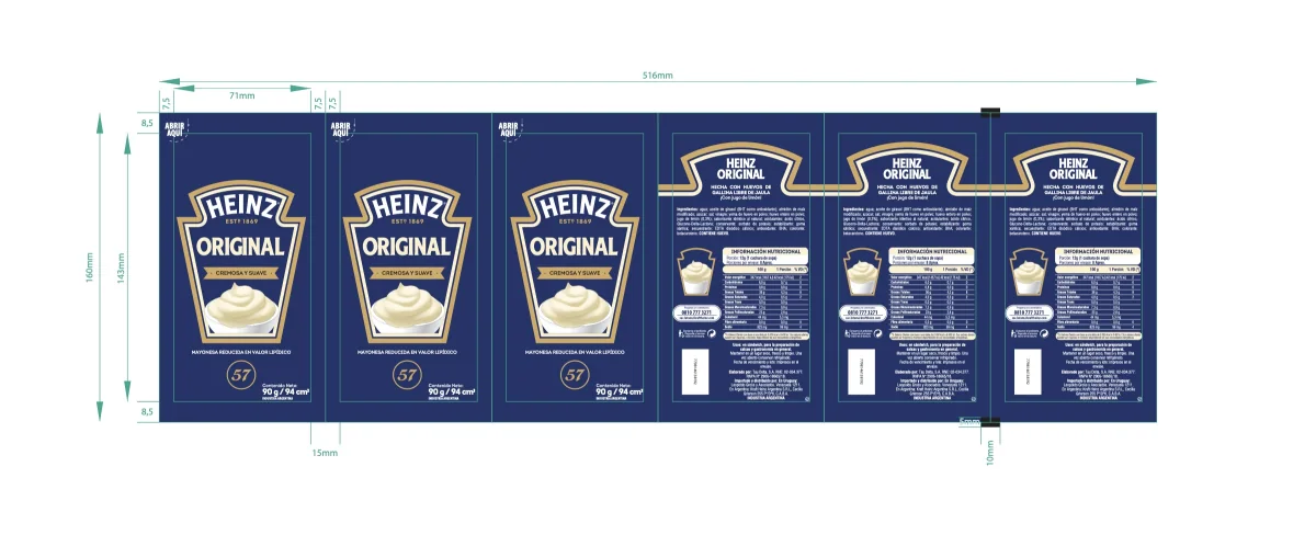
Production artwork for Heinz Mayonnaise 90 g, 2021.
Exploring within the brand
In December 2020 JVD explored a new family of Kraft mayonnaises in squeeze and doypack formats. The system kept Kraft elements and opened a more natural territory, built from the ingredients. It is shown as exploration: not every variant reached the market.
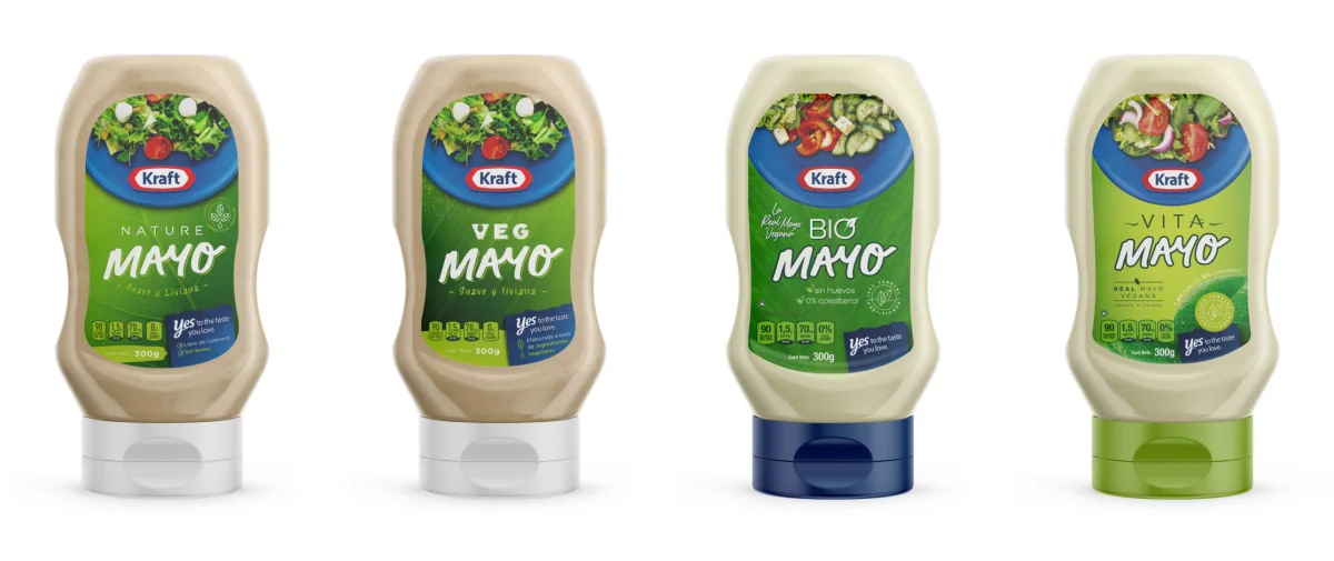
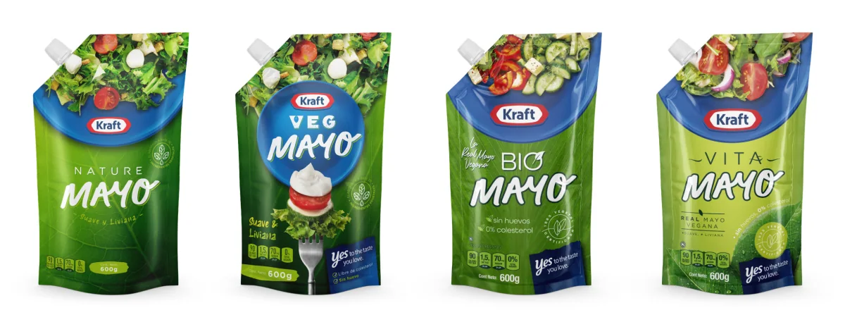
Kraft Mayo family in squeeze and doypack · December 2020 · JVD exploration
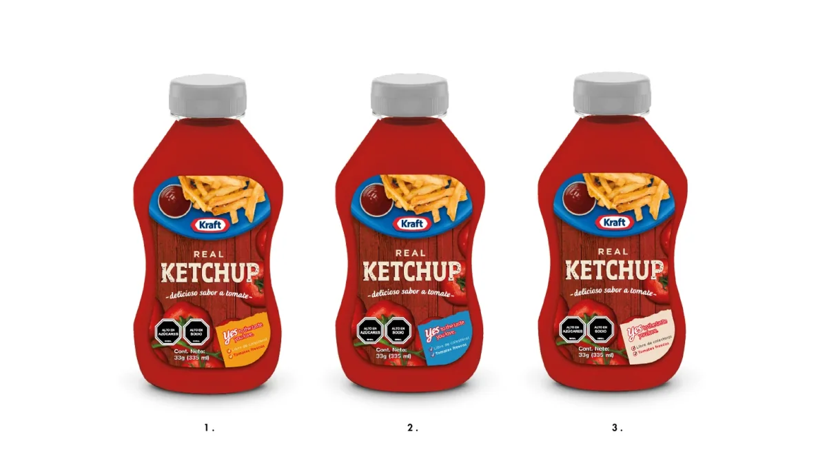
Routes explored before the final Kraft Real Ketchup system.
Evidence
JVD's commercial records list approved projects for Kraft Heinz Chile between 2020 and 2023, including the new Kraft Ketchup design, the mockups and the 2023 art direction. Kraft Chile currently sells its Ketchup in the formats JVD worked on (850 g doypack, 450 g doypack, 400 g squeeze and 90 g display) under the name Real Ketchup.
The global identities and logos of Kraft or Heinz, the Kraft Chile website, product formulation and sales results are not attributed to JVD.
From this case
Kraft Real Ketchup reorganises codes the brand already had so they read the same on squeeze, doypack, sachet and display, and carries every decision through to final artwork.
Talk to us about a packaging system