

STONEVIK
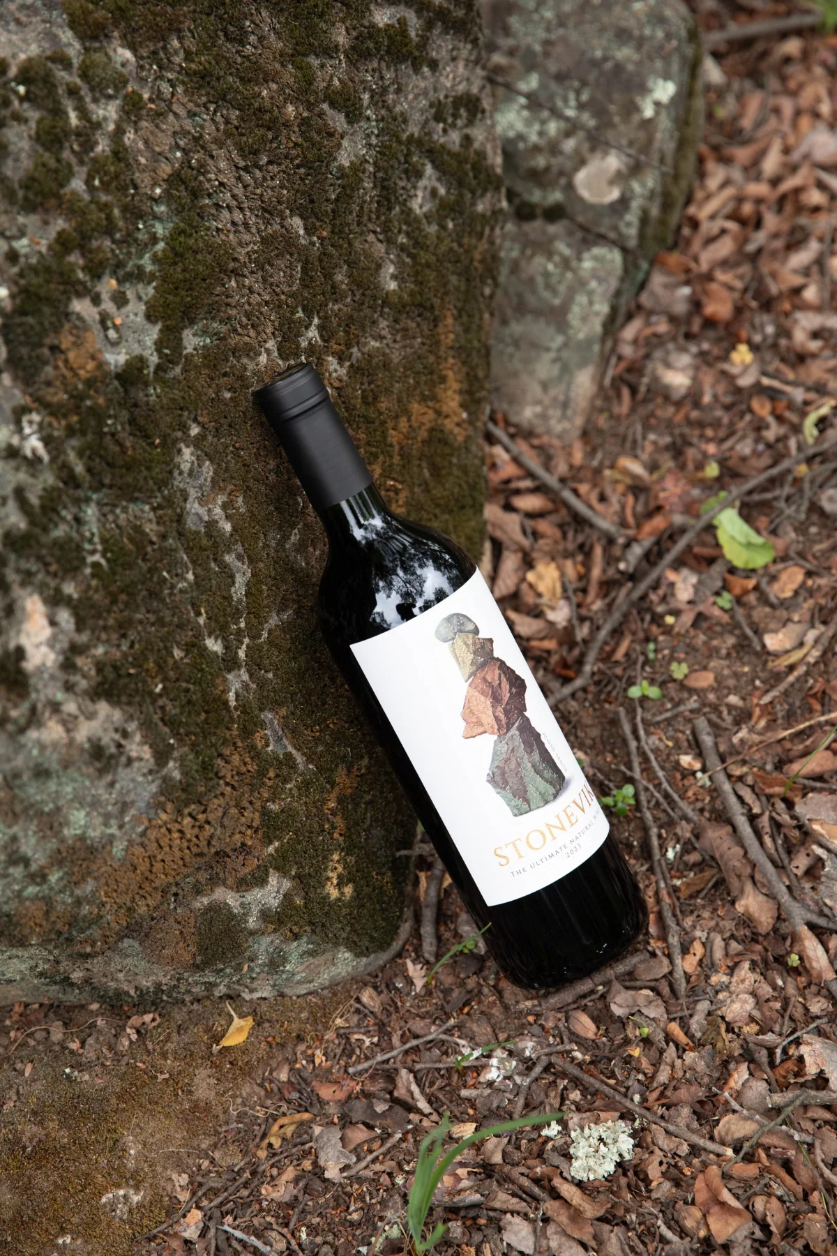
To give form to VIK's iconic natural wine, JVD turned its origin (clay, oaks, amphorae and astronomical cycles) into a mineral, tactile and precise packaging system, built around an original artwork by Chilean artist Álvaro Gabler.
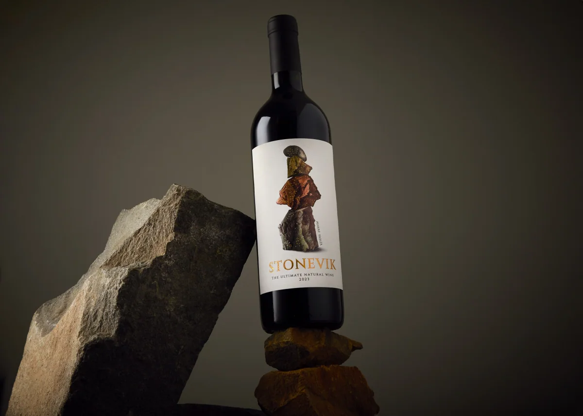
STONEVIK · Viña VIK · 2024 · an identity built from matter, balance and origin
- Client
- Viña VIK
- Project
- STONEVIK
- Year
- 2024
- JVD scope
- Creative direction, packaging concept and system, integration of the artwork, front and back label design, finish specifications, single-bottle case and art direction for the visual presentation
Context
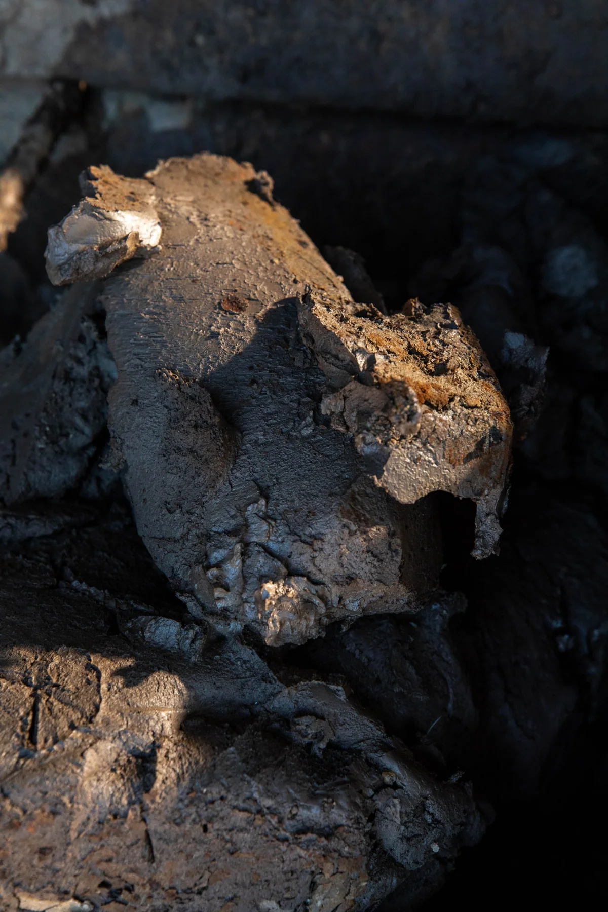
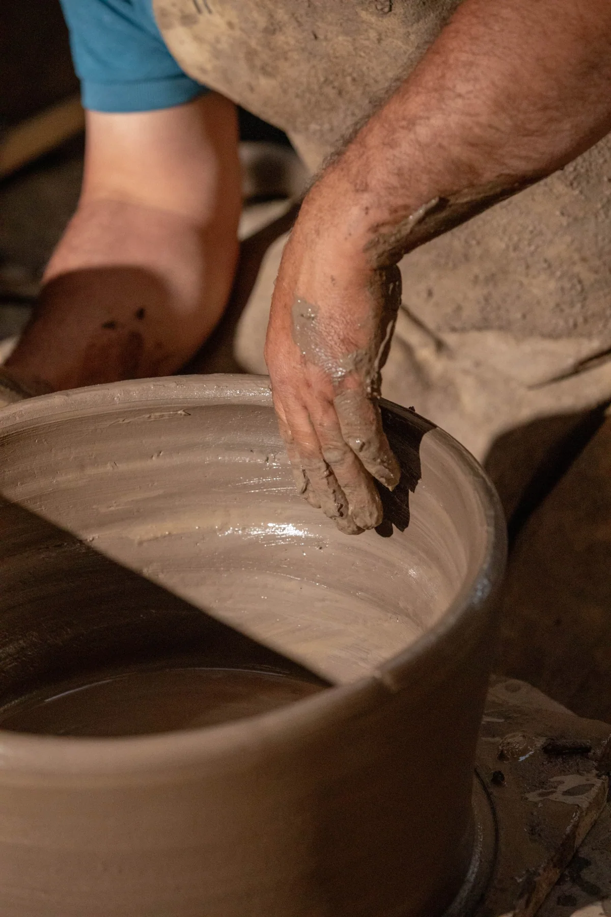
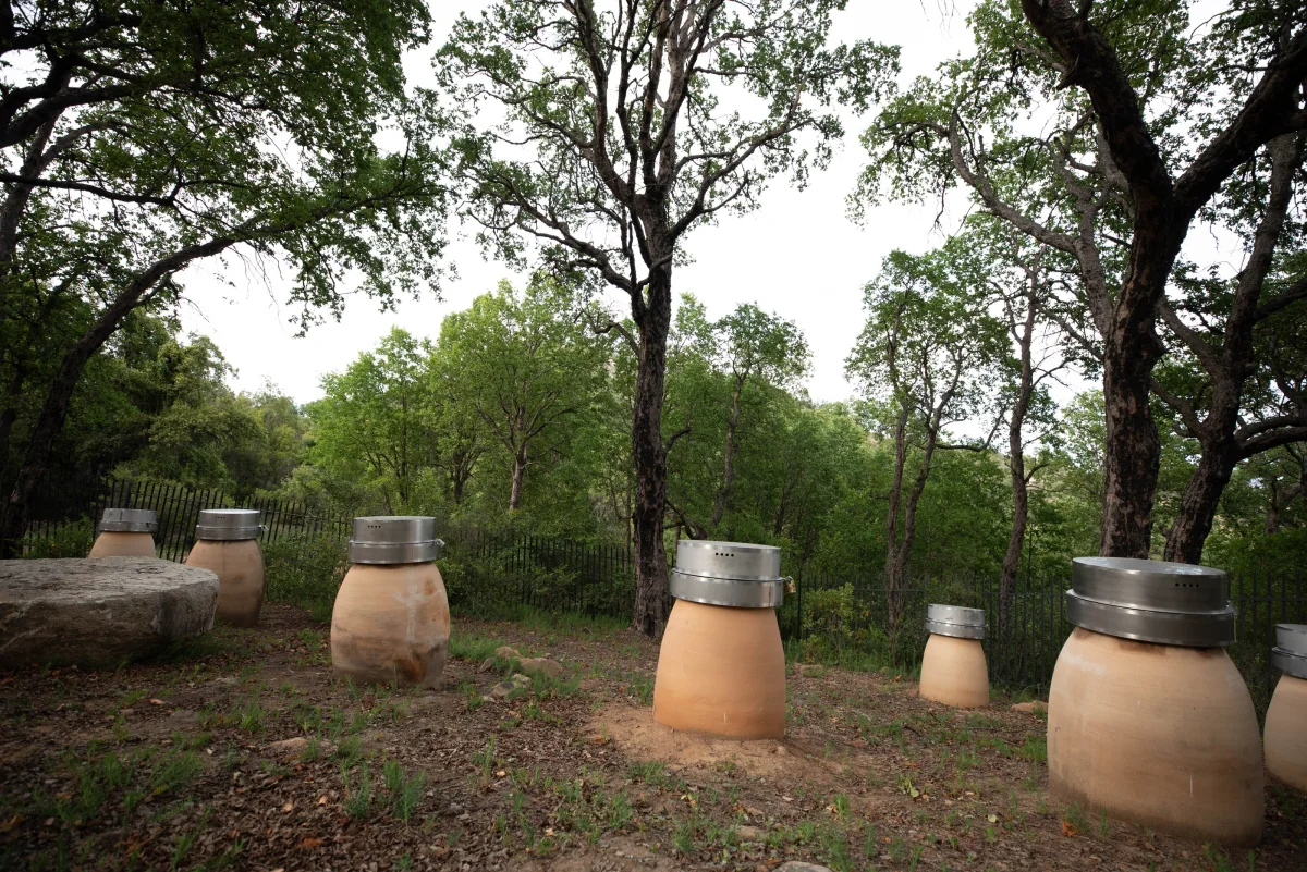
STONEVIK comes from a way of making wine that is deeply tied to its land. It is made from Cabernet Franc, Cabernet Sauvignon and Carménère, ferments over one lunar cycle in native oak barrels and then ages in clay amphorae made with material from VIK's own terroir. The amphorae sit half-buried in La Roblería, surrounded by century-old trees and arranged according to astronomical principles.
The brief was never to illustrate nature literally. It was to build an identity that could express balance, minerality, origin and precision, hold VIK's level of luxury and set STONEVIK apart within the portfolio.
The decision
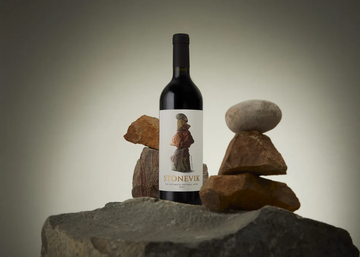
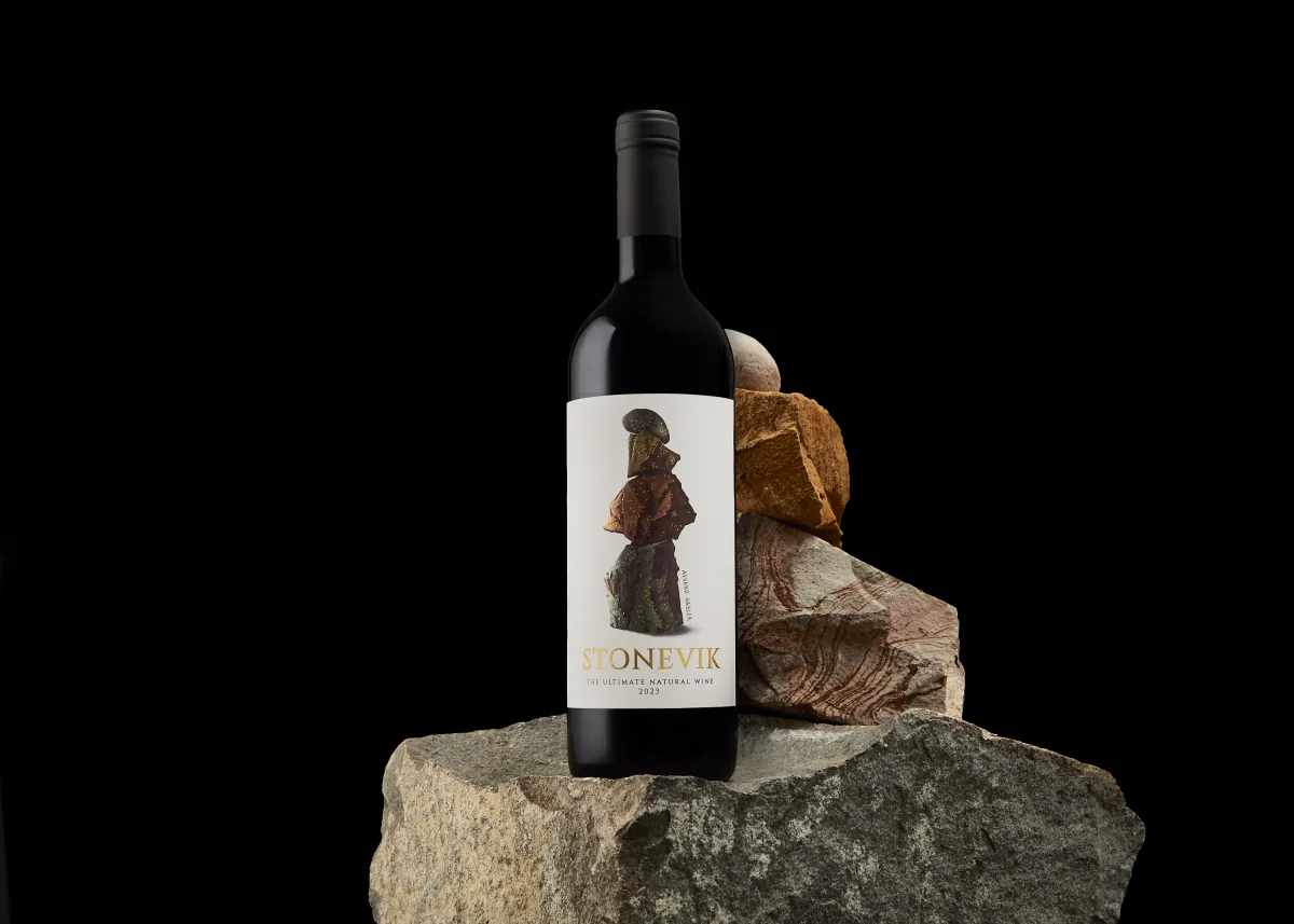
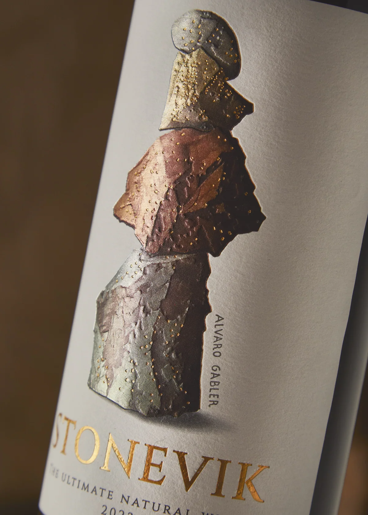
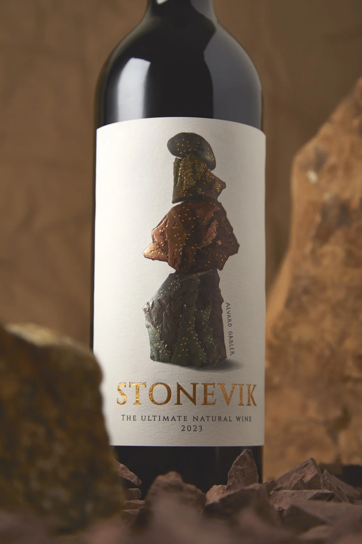
JVD took stone as the visual synthesis of the project: matter, permanence and balance. Álvaro Gabler's original artwork, a figure built from carefully balanced rocks, became the centre of the label. It works as meaning, not decoration: it makes visible the tension between nature and human action that defines the wine.
The form
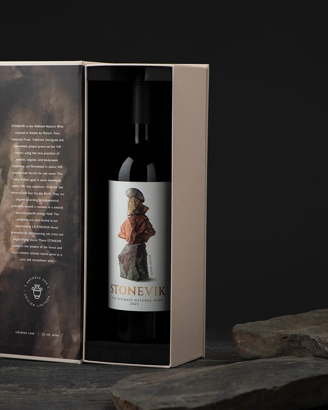
The packaging was built in layers. The label uses a paper with visible fibre and a vertical composition that gives the artwork room to breathe. The logotype and metallic details bring precision, while embossing and raised screen printing turn the surface into something to touch.
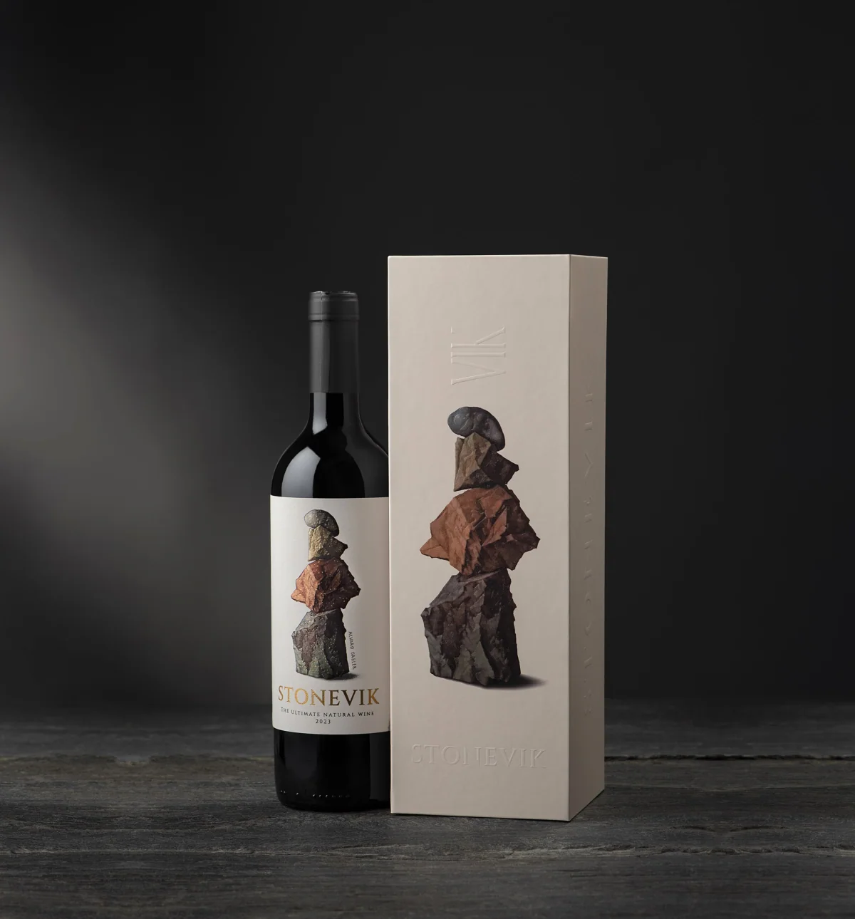
The case carries the mineral language through a restrained exterior, debossed textures and an interior that reveals the wine's story. Opening it brings the bottle face to face with a large rock-inspired graphic surface: a sequence from containment to discovery to origin.
Materials
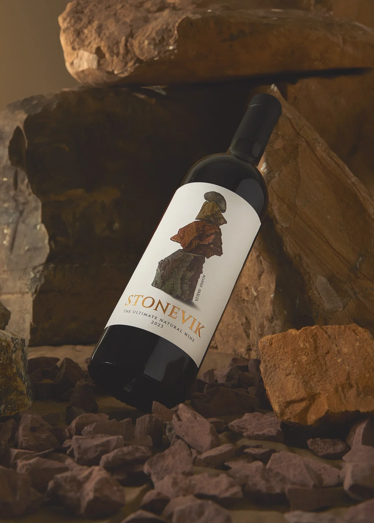
The label specifications called for Fasson White Cotton paper, silver foil, bright gold foil, debossing and matte raised screen printing. The case used Neenah Wrought Iron or an equivalent board, with silver foil, embossing and spot gloss varnish.
None of it is ornament. Each finish helps build a sense of stone, strata and depth.
Origin and process
The process images show the clay, the hand-made amphorae, the oaks of La Roblería and the vessels set out in the forest. They connect the finished piece to the real evidence behind its design decisions.
Result
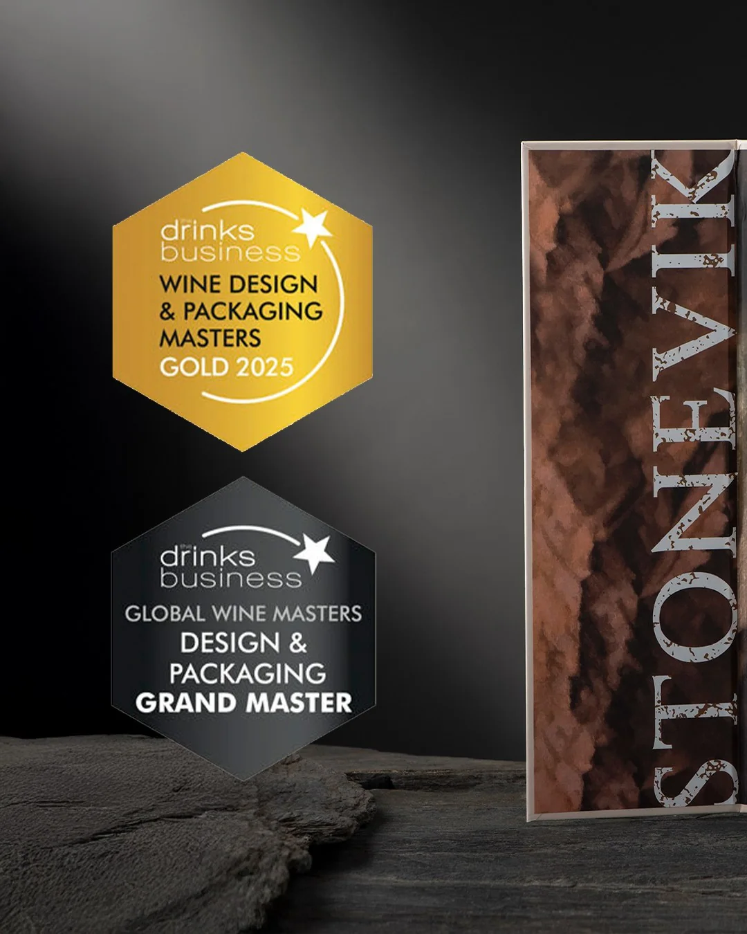
At The Drinks Business Global Wine Design & Packaging Masters 2025, STONEVIK received a Gold medal and the Grand Master, the competition's highest distinction. The case with blind embossing, the matte foil, the fine label paper, the tactile execution and the fit between the balanced stones and the wine's natural positioning were highlighted.
From this case
A natural wine whose origin (clay, oak, amphorae and lunar cycles) became a mineral, tactile packaging system around an original artwork.
Start a conversation