

T.H. Terroir Hunter
Making the search visible.
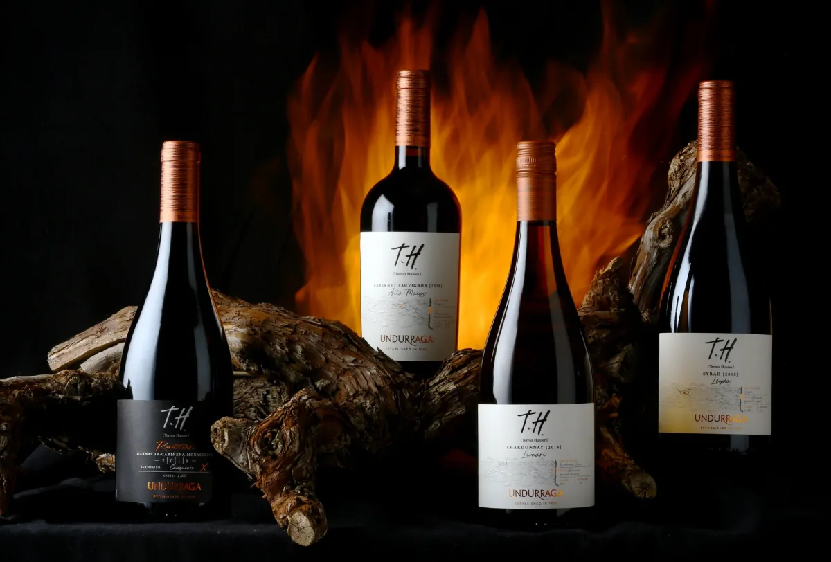
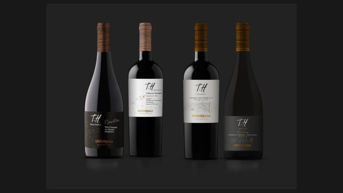
The T.H. family in production · photograph, August 2020.
- Client
- Viña Undurraga
- Project
- T.H. Terroir Hunter · T.H. Rarities
- Year
- 2019
- JVD scope
- Visual identity evolution, packaging architecture, label system, applications and graphic direction.
Context
T.H. already had a powerful idea: seeking out micro-terroirs able to produce wines with a specific origin. The challenge was to make that search visible as well. In 2019, JVD worked with Viña Undurraga on the evolution of the visual and packaging system for T.H. Terroir Hunter and T.H. Rarities.
The challenge
T.H. was central to Undurraga's positioning: quality, exploration, innovation and diversity of origin. But the portfolio had grown. There were many varieties, valleys and small productions, and the graphics did not make clear enough either the differences between them or the story of exploration behind the project.
The concept
The word Hunter became a way of designing. Maps, topographies, routes, marks, notes and concrete data from each site build a visual language that reads like the record of an expedition.
Each label carries its own information: variety, valley, vintage, sub-region, soil, vineyard area and a limited number of cases. Origin becomes visible evidence on every bottle.
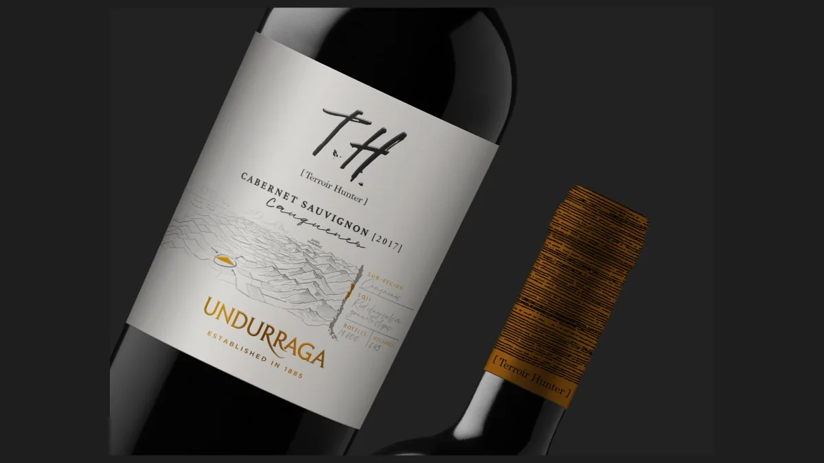
A family that can hold diversity
The solution had to let many wines be different without losing their sense of belonging. The T.H. line uses a light, luminous base; T.H. Rarities switches to black to single out the exceptional finds that emerge along the way. Both share the T.H. mark, the copper code, the topographic texture and the same logic of information. You recognise the family first and discover each origin after.
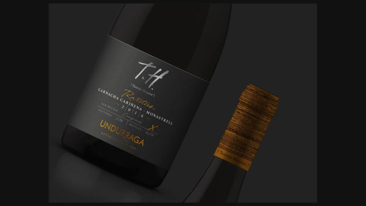
Materials that also inform
The materials reinforce the concept without competing with it. The production specifications call for Killer White paper with micro-embossing, copper foil, screen-printed varnish, matte varnish and debossing. The capsule carries the topography up to the neck of the bottle, turning a functional part into part of the story.
From the wine to the system
The project went beyond the label: adaptations for Bordeaux and Burgundy bottles, back labels, 6- and 12-bottle cases, brand applications, digital pieces and a brand presentation to organise the T.H. story.
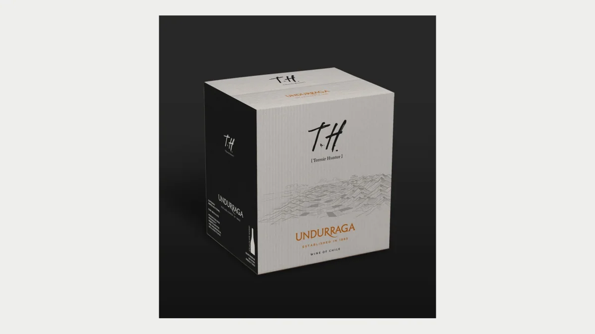
Process
Closing
A good packaging system sets just enough rules for each wine to say what makes it different while still belonging to the family. At T.H., the search was the concept; the design had to make it visible.
From this case
A wine portfolio where every label carries its own origin as evidence, inside one recognisable family.
Talk to us about a portfolio system