

DIVERSA Tequila
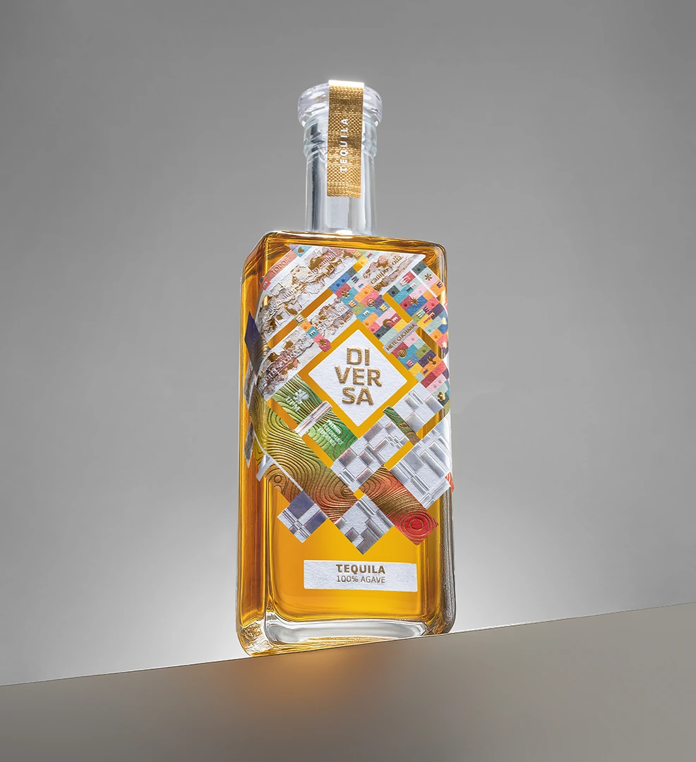
Five Latin American studios designed a single label without seeing each other's work until the end. JVD contributed the Chilean intervention: a material collage built from the textures, landscapes and cultures of the country's 16 regions.
An invitation to work differently.
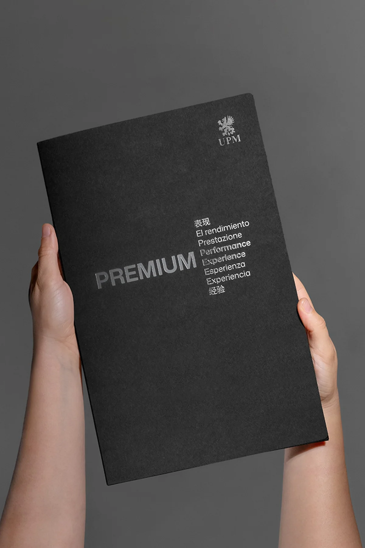
UPM Adhesive Materials asked Tridimage to develop a tequila label for its Premium Performance collection. Tridimage chose to open the project up and invite five Latin American studios to build it together.
Tridimage invited JVD to represent Chile in the collaboration.
Context
Studios from Argentina, Chile, Colombia and Peru took part. Tridimage led a collaboration in which each team worked independently on a shared structure.
- Commissioned by
- UPM Adhesive Materials
- Overall creative direction
- Tridimage
- JVD's role
- Concept and design of the Chilean intervention, upper-left area of the label
- Year
- 2026
The decision
Don't force uniformity up front. Design a system able to hold five different perspectives, and trust a shared Latin American sensibility to create coherence. The reference was traditional weaving: independent parts that gain strength once they are interlaced.
Five perspectives. One piece.
Each studio developed its intervention independently, on a common structure inspired by Latin American weaving and textiles. None of them saw the others' work until the five interventions came together in a single label.
- Tridimage
- Argentina · Overall creative direction
- Boldrini & Ficcardi
- Argentina
- JVD Estudio
- Chile
- INFINITO
- Peru
- LIP / Lucho Correa
- Colombia
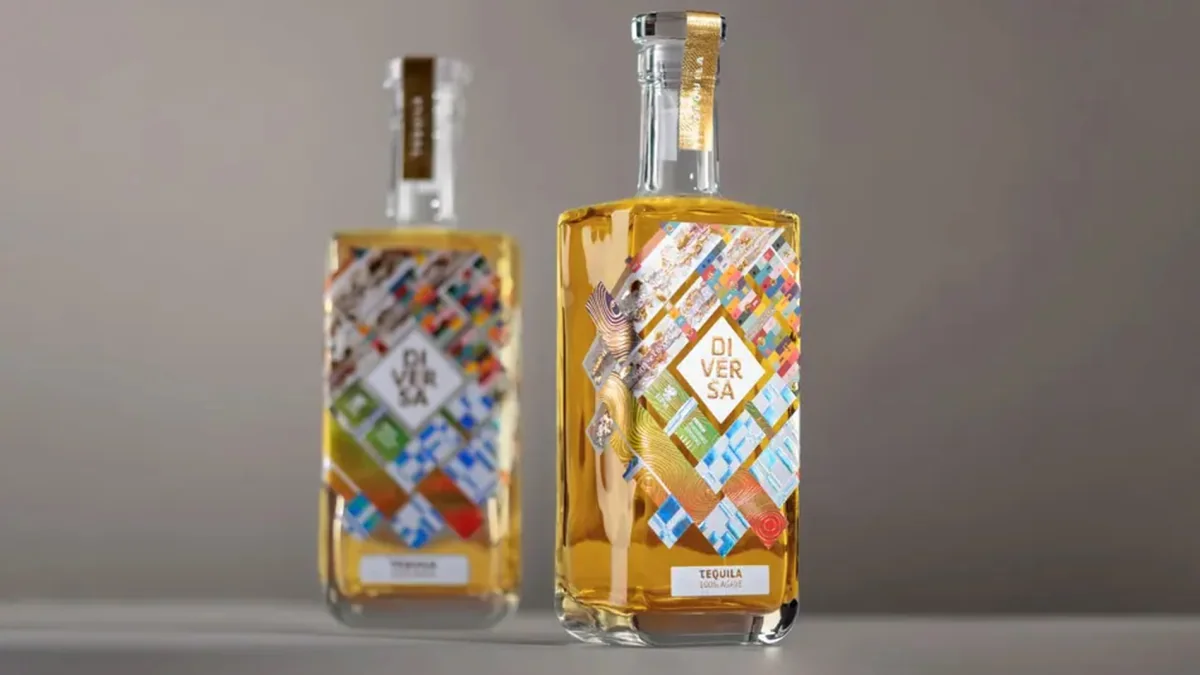
Chile, read sideways.
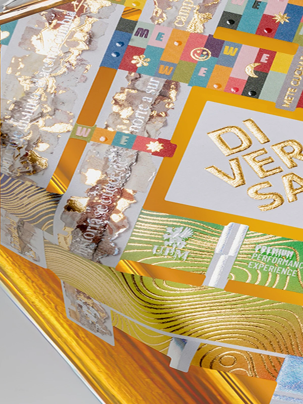
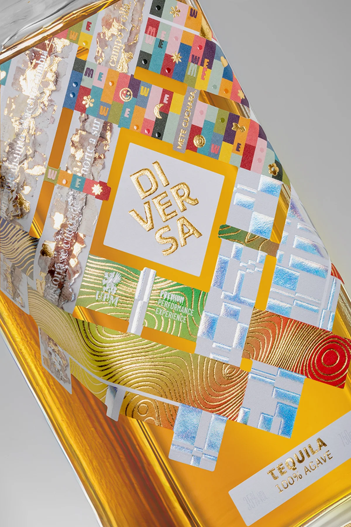
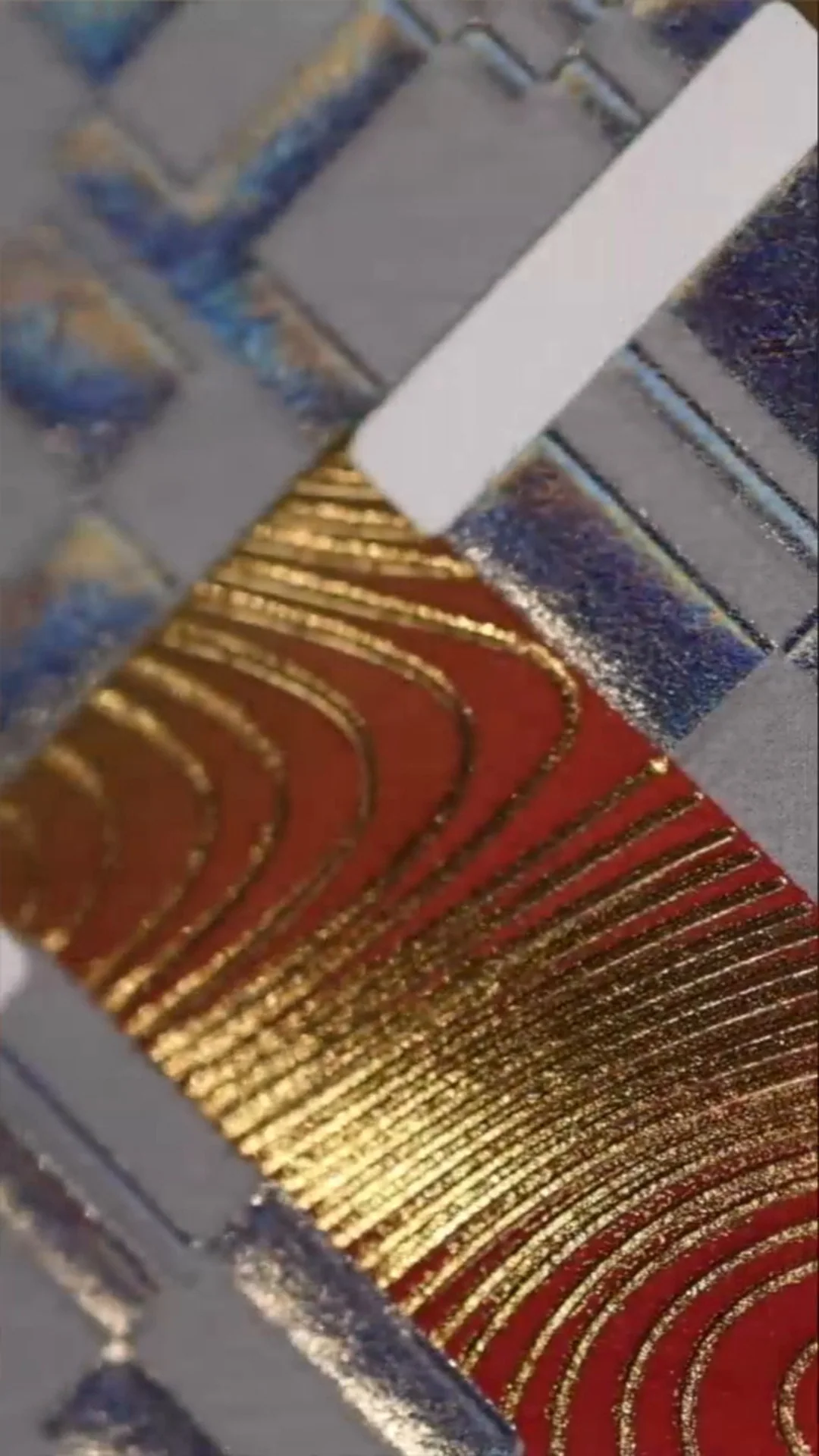
JVD designed the upper-left area of the label, reinterpreting Chile as an abstract collage of textures drawn from its 16 regions. Metallic foils, embossing, micro-details and a hidden local phrase add depth and turn the territory into something you can feel. The full label combined four-colour printing, varnishes, foils, embossing and die-cut details.
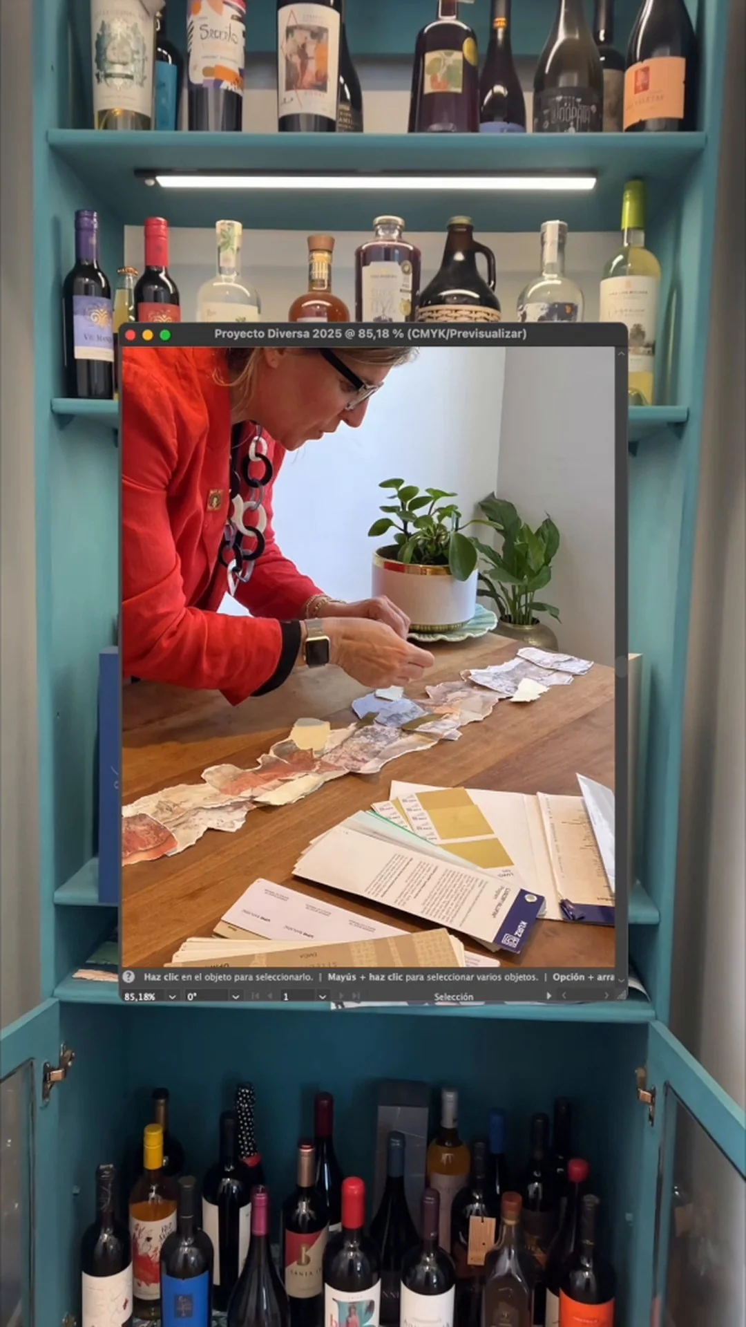
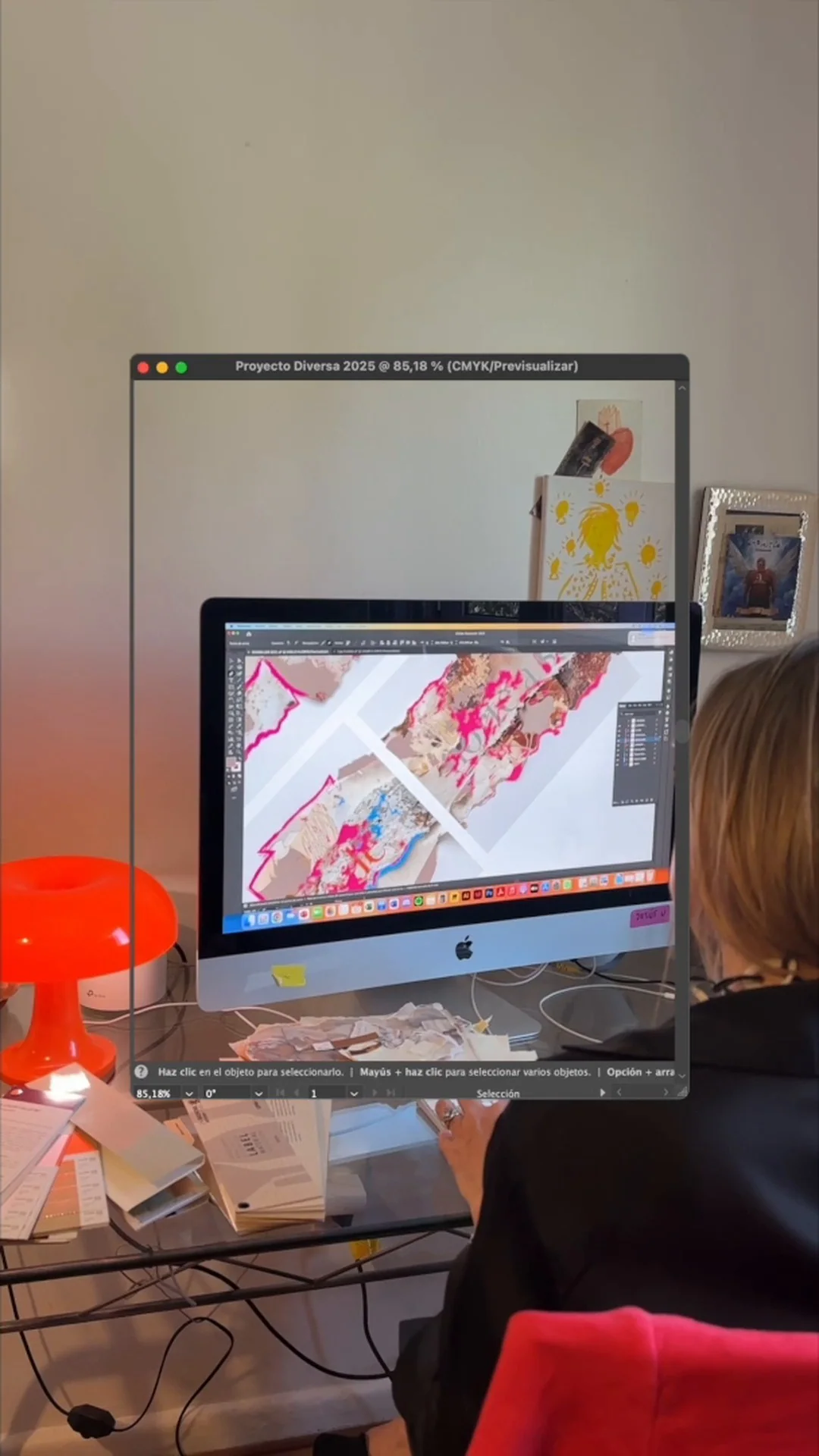
The concept starts from a sixteen-word sentence in Spanish, one word per region, that runs across the label as a horizontal band. Roughly: “Where bread crunches differently, the accent shifts and history simmers from north to south, field and pot”. The visual language began as a physical collage of hand-cut and torn papers, with textures inspired by the sands of the north, the clays of the centre and the fibres and forests of the south, later translated into the digital artwork.
Materials
Copper, bronze and gold metallic foils, spot embossing and tactile relief build a geography that can also be read by hand.
A choral piece.
DIVERSA doesn't try to erase the differences between the perspectives that made it. Its strength lies in how those differences meet and become one piece: a shared creation rather than an individual authorship.
Recognition
DIVERSA Tequila received the KURZ Best Use of Embellishment Award, Bronze level, at Pentawards 2026 (London, 16 October 2026). The award was entered by Tridimage and recognises the complete label, created by five studios: Tridimage, Boldrini & Ficcardi, JVD Estudio, INFINITO and LIP. It was also shortlisted in category E.07 Best Collaboration.
DIVERSA confirmed something we believe in: a point of view doesn't lose strength when it meets others. It expands. Collaborating also means listening, trusting, making room and contributing what each of us does best.
From this case
A collective piece by five studios for UPM; JVD designed the Chilean intervention. Metallic foils, embossing and micro-details turn the textures of Chile's 16 regions into a surface that can be read by hand.
Start a conversation